Other Things
Though I've been primarily focused on product design and solving problems in the urban mobility space, I've made some time for those other projects inbetween.

Icons and Illustrations
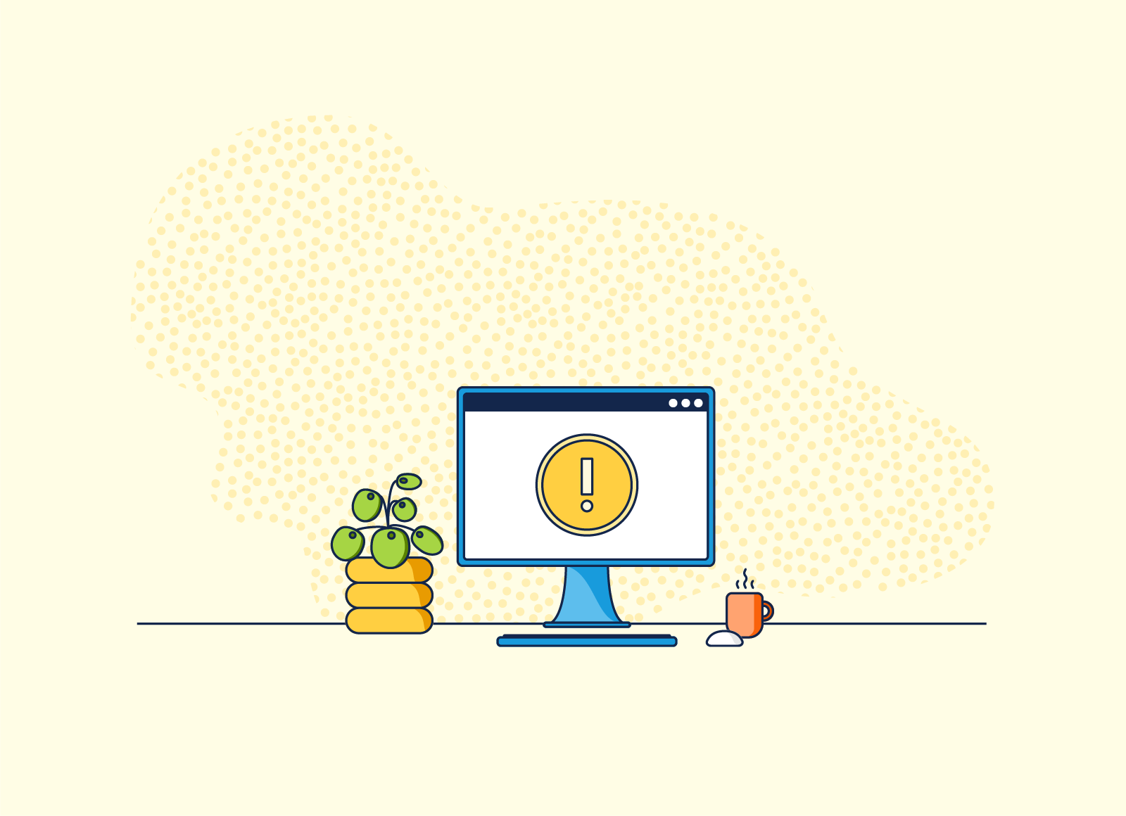
Unsupported Browser
When Remix discontinued application support in Microsoft IE, we needed a friendly way to communicate that. The desk illustration supported gentle messaging that informed users of the change.
Drinks
As Getaround began launching in new cities, each launch would be kicked off with an opening party. This set of icons was designed for the bar menus at these events. These were designed to follow Getaround's illustrative style.
Tacos & Cacti
This set of illustrations was created for employee appreciation day. moovel celebrated by hosting a breakfast taco bar and each employee received a succulent for their desk. To keep things light-hearted and whimsical, I chose to anthropomorphize the themes.
Logos
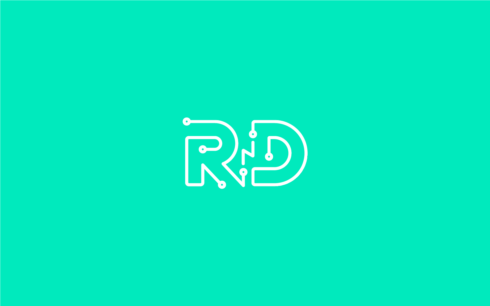
RnD
Like many cross-functional teams, each of moovel's teams have their own unique story. The Research and Development team wanted a logo to represent that. I designed something geeky and fun with a nod at the hardware they build.
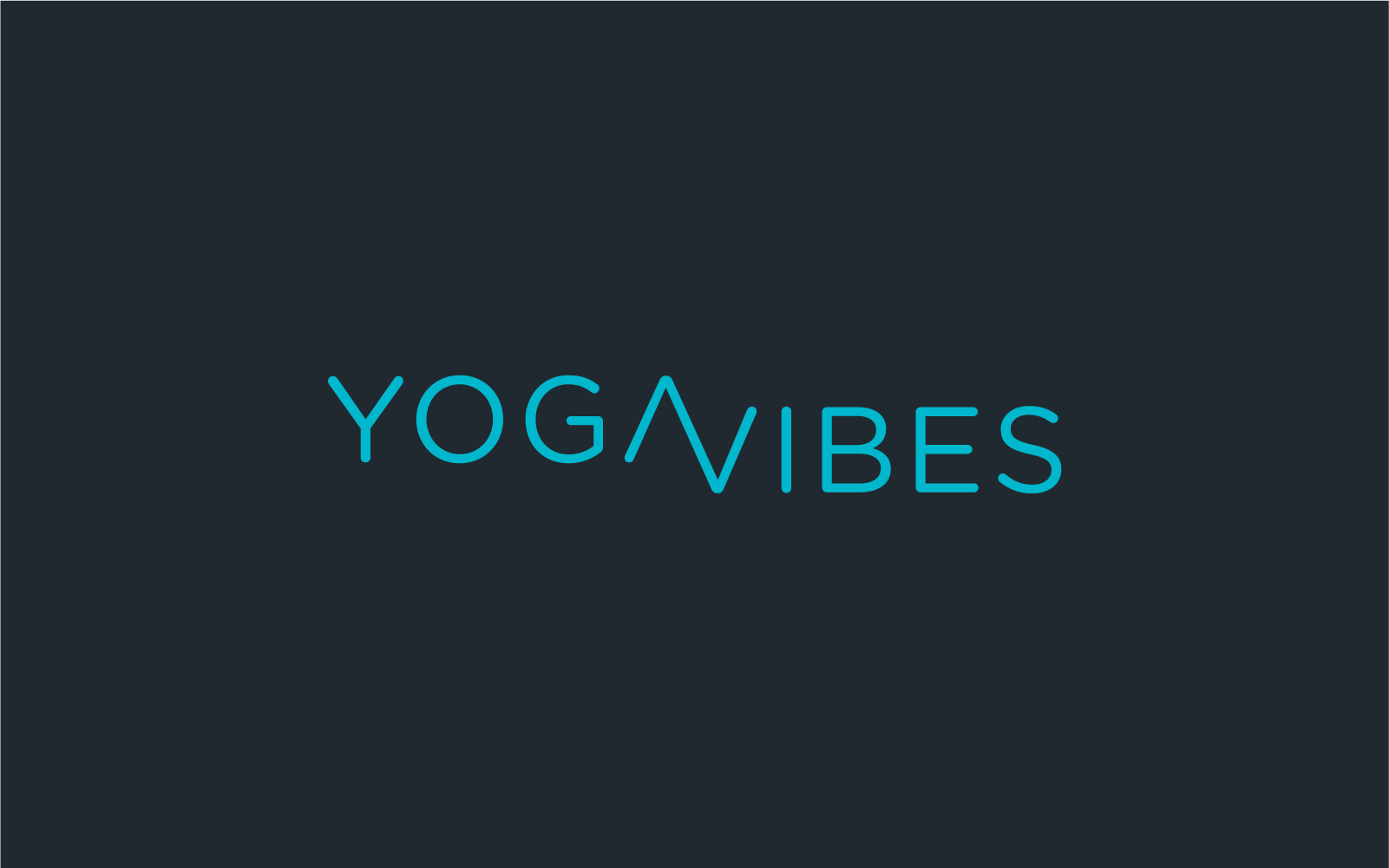
YOGA VIBES
This logo was designed for a yoga instructor with a studio that incorporated vibration plates into the practice. I wanted to keep the logo modern and clean.
Websites
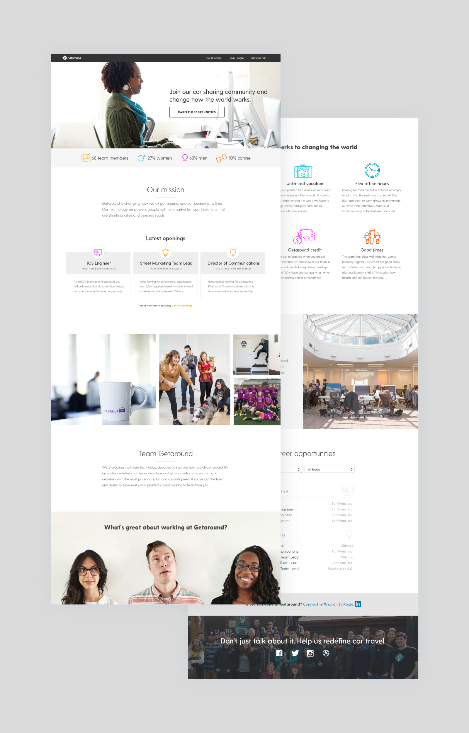
Jobs Page
At Getaround, our jobs page was lackluster and resulted in a lower number of applicants. This is a redesign of the page to showcase more character and culture at Getaround through company stats, perks, anecdotes, and photos. I focused on increasing viewer engagement by adding CTAs and providing relevant content.
The Best Part of Getaround
As part of the jobs page update, I included a section that would highlight Getaround team members and what they love most about the office. This space encourages humor and anecdotes to give applicants the warm fuzzies.
Job Application Success
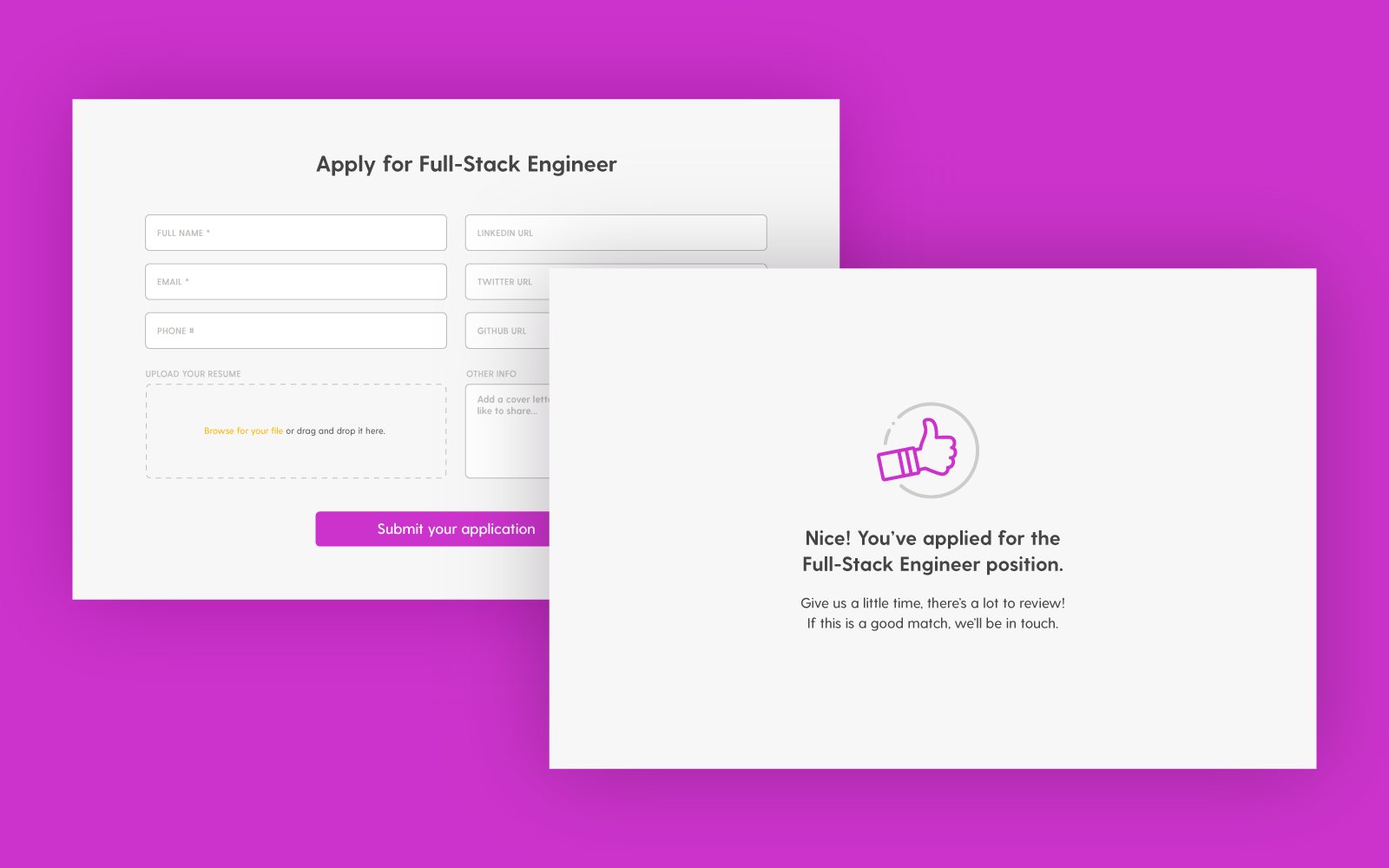
Before the redesign, potential employees were linked to a third-party application page. I wanted to include the application process within our own site so that I could control the messaging and flow. This updated experience gives users more information and keeps the tone on brand.