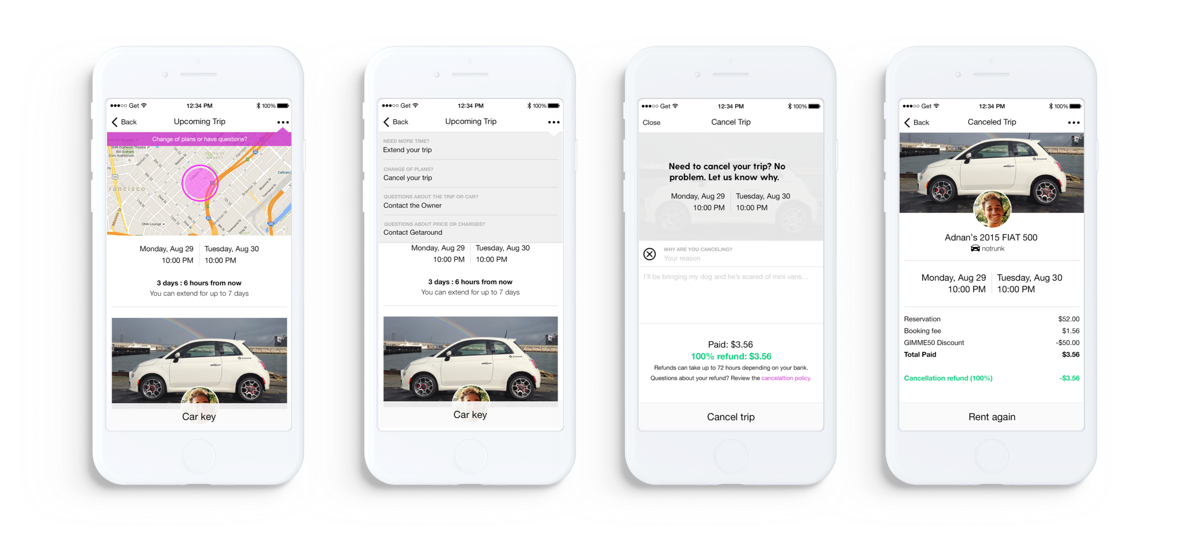
Cancel Trip
Getaround | iOS + Android
.Overview
Getaround is a carsharing platform where car owners rent out their cars to people nearby. It allows renters to instantly rent cars by the hour or even daily.
As a Product Designer at Getaround, I led the design of Cancel Trip feature, a way for renters to cancel their car rental through the native mobile app. I partnered with the Product Manager on UX research and I was responsible for wireframing, copywriting, ideating, testing, and UI design.
Understanding the Problem
Before this feature was introduced, renters had to call or email Getaround customer support in order to cancel a trip—both of which require waiting periods and cause friction. This manual process was the source of a significant amount of work for the customer support team. Trip cancellations were the number one reason for calls made to customer support.
Constraints
In order to bring down customer support call volume caused by cancellations, we would need to consider 1) how both car renters and car owners cancel trips 2) updates to both the web and mobile experiences 3) cancelling AND modifying a trip. In order to quickly ship a solution with the most impact, we scoped this into phases and Phase 1 would focus on addressing the renter experience in the mobile app.
Objectives
After defining the problem, the PM, the customer support lead, and I agreed on a set of objectives:
- Allow the renter to easily cancel trips through the iOS app.
- Give the renter clear information about Getaround's cancellation policy and refund amounts.
- Ensure the collection of appropriate cancellation fees to keep a healthy balance of supply (cars) and demand (renters).
- Success metric: bring customer support call volume down a third (Phase 1).
Exploration
Brainstorming and Ideating
Mapping out Scenarios
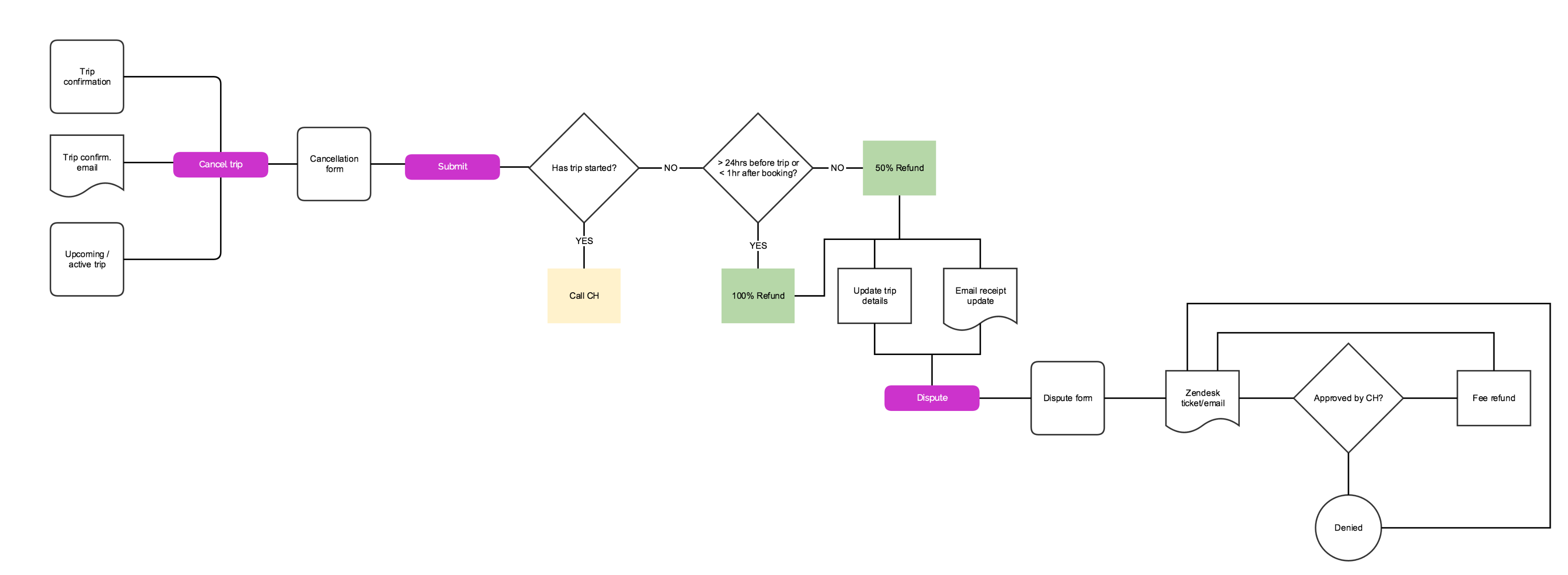
Working with the customer support team and their established cancellation fee policies, I mapped out a task flow (see above) to understand how the cancellation policy would affect renters in various scenarios and what information we would need to display.
Scenarios:
- The renter wants to cancel their trip 24hrs or more before it starts OR less than an hour after they booked it.
- The renter wants to cancel their trip less than 24hrs before it starts.
- The renter begins canceling the trip 24hrs prior to the start time within the app. They get distracted while in the app and don't complete cancellation in time to receive a full refund.
- The renter cancels their trip but is refunded less than they were expecting. They'd like to understand why and dispute it.
- The renter wants to cancel their trip after it has started.
Introducing another action
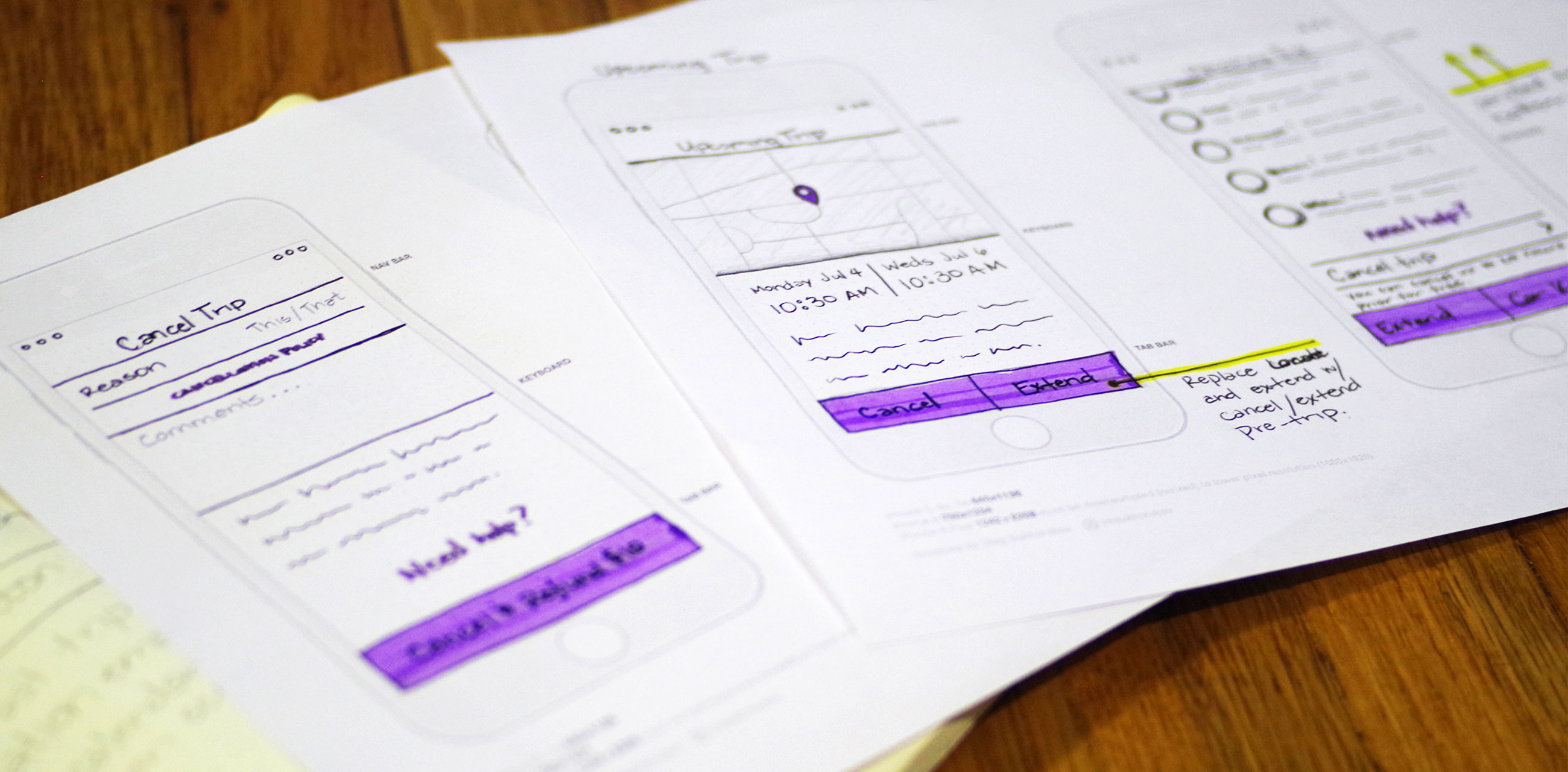
There are several actions the renter can take when renting a car. And those actions change depending on whether the trip is in the past, present, or future. For example, a renter can extend a rental either before or during the trip period. Also, a renter can unlock their rental car during a trip, but not before the trip starts.
I created paper prototypes and tested ways to introduce this new action, Cancel Trip, into the existing design.
A Dropdown Menu
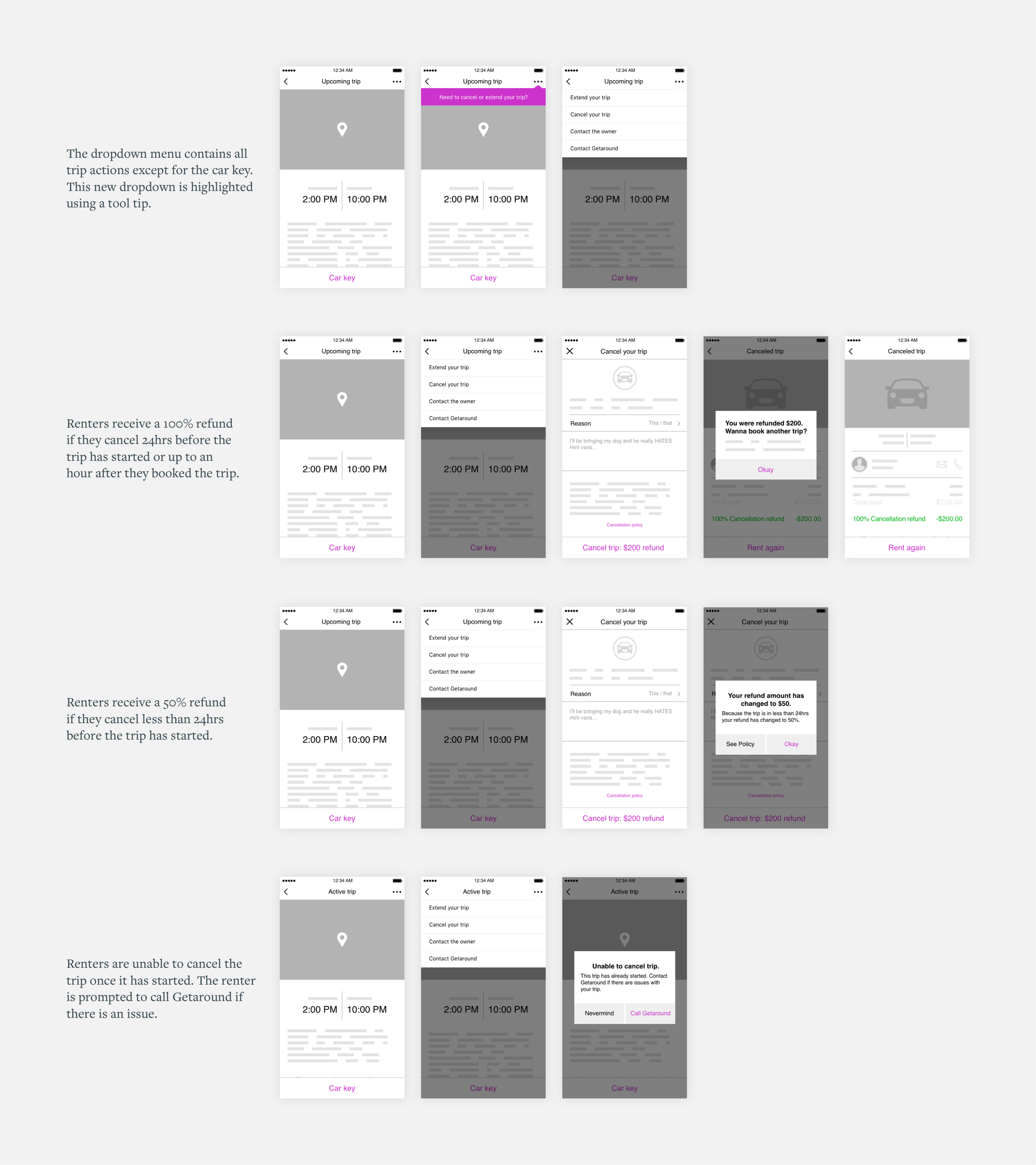
After testing with paper prototypes, it became clear that there were too many actions on a single screen. Instead of having several actions scattered, I tried a different approach: gathering all trip actions into a single dropdown menu. While we knew it buried the button and made it a tiny bit harder to discover, we knew we it would move us forward faster and have immediate impact. We also knew that we needed to address the layout and information architecture of this trip screen holistically (as a separate project) to improve the learnability and discoverability of all of the content and actions.
Understanding cancellation reasons, fees, and policies
Getaround has an established set of policies and fees that ensures car owners are reimbursed adequately for lost compensation due to cancellation and encourages renters to cancel trips in a timely manner so that cars may still be rented by someone else–this ensures a balanced peer-to-peer carsharing marketplace. To maintain this balance, this feature would collect a different set of fees depending on when the user decides to cancel the trip. This meant renters would need a clear understanding of refund amounts.
It was important to collect information that would describe why cancellations were happening. This insight could help identify problems or even opportunities in the future.
After the Trip has Started
It was important to keep this action accessible even outside of the cancellation period. Instead of hiding the feature and potentially confusing the renter, we prompt them to call customer support to help them with problems they might encounter once a trip has started.
Outcome
Final Deliverables and Conclusion
Screen Flows
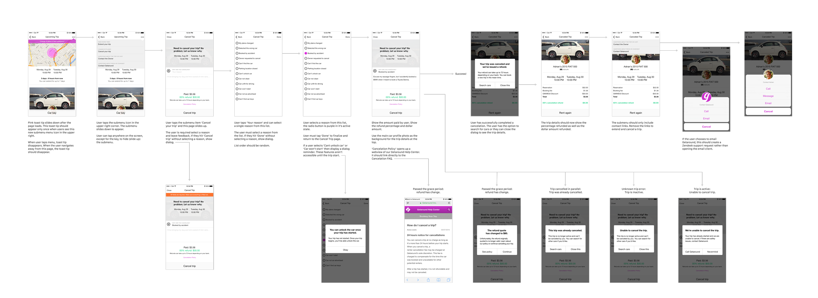
After creating high fidelity comps, I created screen flows that documented all of the scenarios and interactions that a renter would experience. This deliverable was used for engineering implementation.
Learnings
The design leaned heavily on a tool tip which successfully introduces the new feature. But as a next step, I would continue to push the design and make the 'Cancel Trip' feature easier to find and more intuitive.