App Redesign Tour
moovel | iOS + Android
.Overview
moovel builds products that allow transit agencies and transit riders to engage in an entire transportation ecosystem.
As a Product Designer at moovel, I worked on the redesign of our transit ticketing app. A crucial part of this project was creating a new tour that will ease existing users into the redesigned app. As the lead designer on this project, I was responsible for UX research, wireframing, copywriting, ideating, visual design, prototyping, and user testing.
Understanding the Problem
In general, opening a newly designed app can be a jarring experience for users who are familiar with an older interface. First, I wanted to understand what the users might think or feel when seeing the redesigned app.
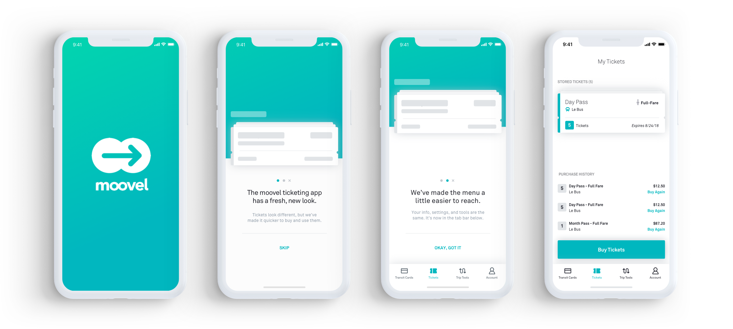
I partnered with a UX Designer and interviewed users as they interacted with the old app and then the new app. Most users stated a general anxiety and confusion about being able to find their existing tickets. Although, users immediately noticed that the navigation was in a new location they still felt slightly disoriented.
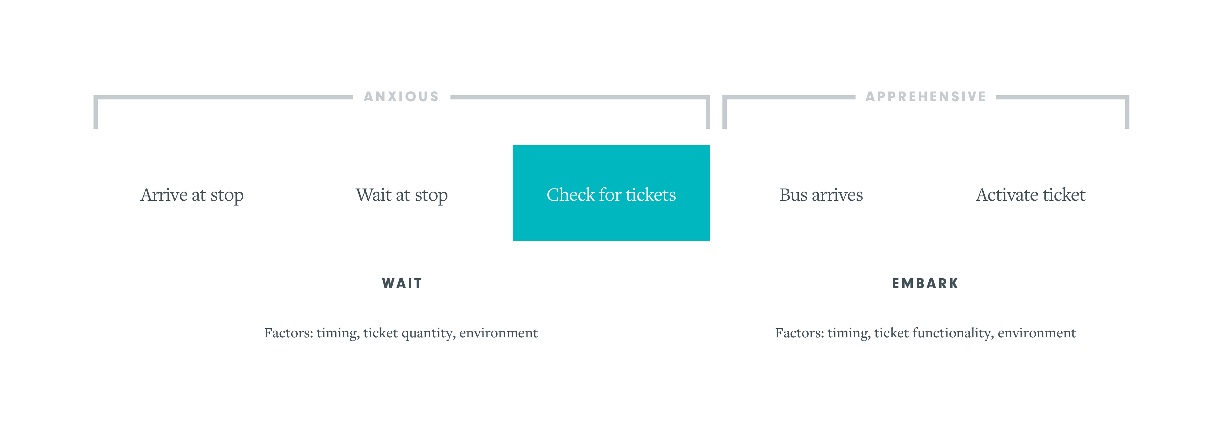
Using our existing journey map, I easily identified user touchpoints that would be affected by an app update. In the updated design, one of the most predominant changes in the experience is the location of available tickets. This was a cause for concern since users specifically need to be able to quickly purchase tickets or activate a previously purchased ticket.
Objectives
After defining the problem, the Product Manager and I agreed on a set of objectives:
- Quickly guide user through ticket hub changes.
- Reassure user that their information would still be available.
- Give the user a quick way to leave the onboarding experience.
Exploration
Brainstorming and Ideating
Wireframes + Flows
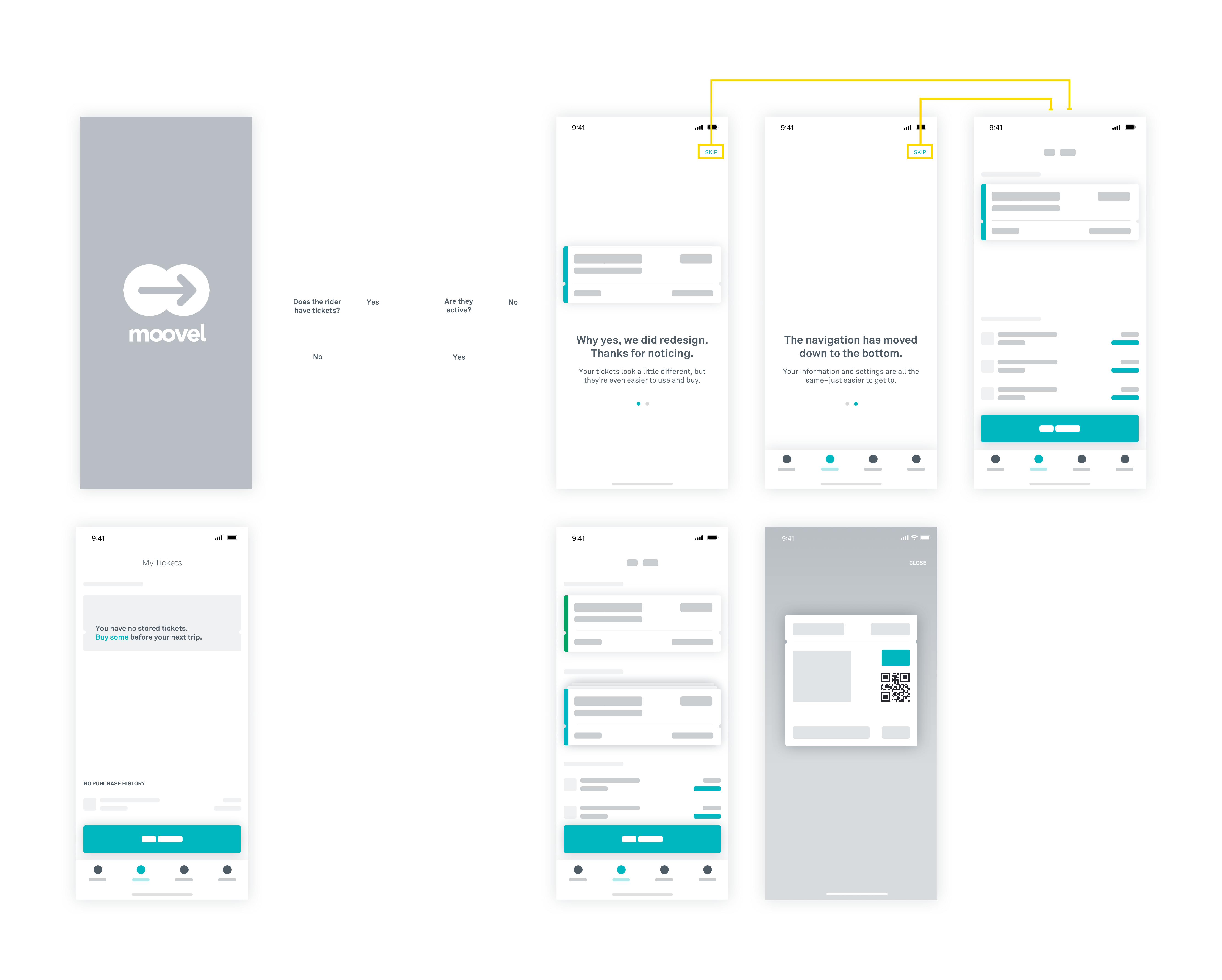
I created wireframes to quickly get ideas out. From those, I created a screen flow to map out use cases as well as edge cases. For example, what happens if a user has an active ticket? Is it appropriate to disrupt the user in this case? I consulted with the dev team to understand if my ideas were possible. I also started to generate some rough copy.
Inspiration
I looked at a lot of user onboarding and tour experiences in various other applications. I was drawn more towards experiences like Headspace's which offered an unobtrusive overlay; I steered away from tours with too much information or illustrations.
Outcome
Iterating, Prototyping and the Conclusion
Testing and Iterating
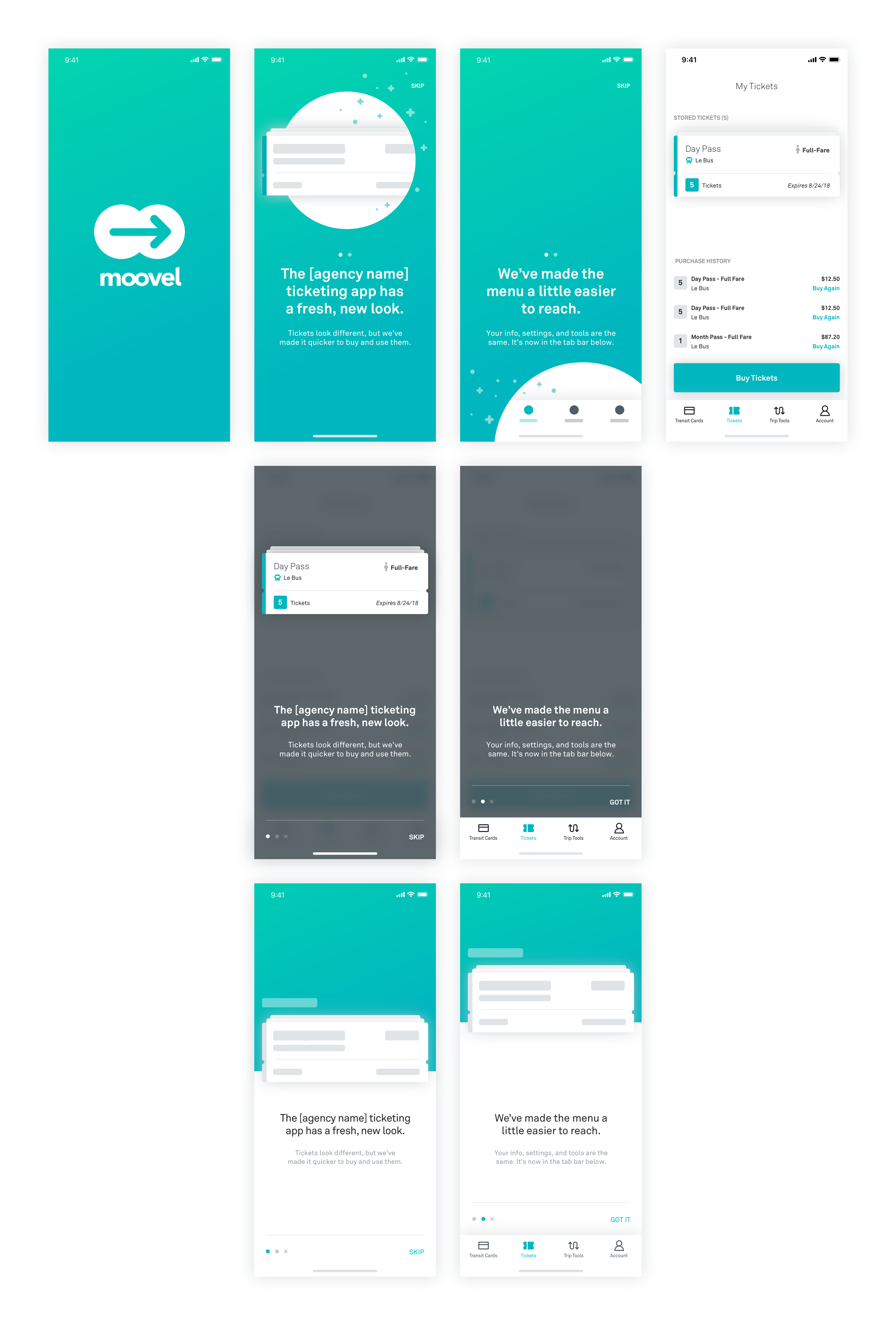
The first several iterations focused on creating a tour that felt light and contextual. I explored different ways to introduce the new look of the ticket and the changes to navigation. This also included copy explorations to find the right words to inform the user of the value of the redesign and to reassure them.
Further iterations were necessary to test usability. Because users could find themselves in the tour with the intention of purchasing and/or activating a ticket, it was important to understand how quickly and accurately users could swipe through or leave the tour. I built several prototypes to test and challenge my assumptions of how users would move through it.
Measuring Success
I will be tracking how quickly users tap the 'Skip' button. In addition to analytics, we will be conducting contextual interviews and monitoring app store reviews that could reveal general sentiment around the tour.
Learnings
The initial project was kicked off without consideration for our existing users. The new user onboarding experience was designed at the beginning of the app redesign. This caused a gap in the experience for an existing user who is logged out and treated as a new user.